Data Analysis and Visualization - Python
Introduction
This post is based off a dataset I was working with recently as a side project. I wanted to put some of Python’s libraries to use, like matplotlib, seaborn, keras and pandas. My goal was to identify some correlations in the data through visualization techniques, and design a multi-layer perceptron that could leverage these correlations in order to make accurate predictions on previously unseen parts of the dataset.
So, this is my (novice) experimentation with visualizing, analyzing and predicting the dataset.
The Dataset
The dataset is a collection of ~80,000 rows (split into roughly 60,000 training and 20,000 test) of information about how people spend their time per week. It highlights certain activities like hours spent sleeping, watching TV, caring for children, etc. and lastly has a column indicating whether they are employed, unemployed, or not in the labor force.
So, I want to look for correlations between a person’s employment status and the time they spend doing various activites throughout the week.
Here are the first few lines of the data, to give you an idea:
print(df.head())
   Id Education Level  Age Age Range  Gender  Children  Weekly Earnings  Year  \
0   1     High School   51     50-59  Female         0                0  2005
1   2        Bachelor   42     40-49  Female         2             1480  2005
2   3          Master   47     40-49    Male         0              904  2005
3   4    Some College   21     20-29  Female         0              320  2005
4   5     High School   49     40-49  Female         0                0  2005

   Weekly Hours Worked  Sleeping         ...          Job Searching  Shopping  \
0                    0       825         ...                      0         0
1                   40       500         ...                      0       120
2                   40       480         ...                      0        15
3                   40       705         ...                      0       105
4                    0       470         ...                      0         0

   Eating and Drinking  Socializing & Relaxing  Television  Golfing  Running  \
0                   40                     180         120        0        0
1                   40                      15          15        0        0
2                   85                     214         199        0        0
3                   30                     240         240        0        0
4                   35                     600          40        0        0

   Volunteering      Total   Employment Status
0             0  24.000000          Unemployed
1             0  21.583333            Employed
2             0  17.733333            Employed
3             0  26.833333            Employed
4             0  23.750000  Not in labor force

[5 rows x 25 columns]
The first thing I decided to do to clean up the data a little bit was to change all non-integer values into integers. Meaning, anywhere there was not a real number - for example, in “Education Level”, “Age Range”, and “Employment Status” - I changed it to a number.
This process does take some thinking, however. The numbers that I replace the words matter, so I have to be sure to assign them the right value accordingly. First, I changed “Education Level” into a number from 1-10:
#Replace education level with a number
df = df.replace("9th grade", 1)
df = df.replace("10th grade", 2)
df = df.replace("11th grade", 3)
df = df.replace("12th grade", 4)
df = df.replace("High School", 5)
df = df.replace("Associate Degree", 6)
df = df.replace("Some College", 7)
df = df.replace("Bachelor", 8)
df = df.replace("Master", 9)
df = df.replace("Doctoral Degree", 10)
df = df.replace("Prof. Degree", 10)
I assigned a value based on how much education they had achieved, increasing it by 1 for each level up until doctoral degree/prof. degree, which are arguably both the terminal level of education.
A similar process was used for “Age Range”:
#Replace age range
df = df.replace("0-19", 1)
df = df.replace("20-29", 2)
df = df.replace("30-39", 3)
df = df.replace("40-49", 4)
df = df.replace("50-59", 5)
df = df.replace("60-69", 6)
df = df.replace("70-79", 7)
df = df.replace("80+", 8)
For “Gender” and “Education Status”, however, the process was a bit different. Being male or female does not mean one has a higher value, nor does unemployment/employment/not being in the labor force. So, I had to use a process called one-hot encoding to transform the data.
One-hot encoding is a simple process commonly used in machine learning which allows for us to change a list of classifications or results into binary options. For “Employment Status”, the table looked like this:
| Employment Status |
|---|
| Unemployed |
| Employed |
| Employed |
| Not in labor force |
If we change it simply into numbers like we did above, for example reassign values from 1-3:
| Employment Status |
|---|
| 1 |
| 2 |
| 2 |
| 3 |
It will seem like employed has a higher value than unemployed, and not in labor force has a higher value than being employed. However, they are not better or worse than the others, they are just different classification labels. So, we use one-hot encoding to create binary options like this:
| Unemployed | Employed | Not in labor force |
|---|---|---|
| 1 | 0 | 0 |
| 0 | 1 | 0 |
| 0 | 1 | 0 |
| 0 | 0 | 1 |
This way, when the data is fed into a machine learning algorithm, it will be able to learn that these are labels/results that every person is grouped into, not characteristics with specific values assigned to them.
Visualizing the Data
Now that the data has been cleaned up a bit, I find it useful to start visualizing the data to see how certain features correlate. This can give us some insight and intuition on how we should build our ML algorithm.
I used the correlation function built into pandas in order to create a chart. This shows us generally where we should draw our attention, depending on the strength of correlation between different features:
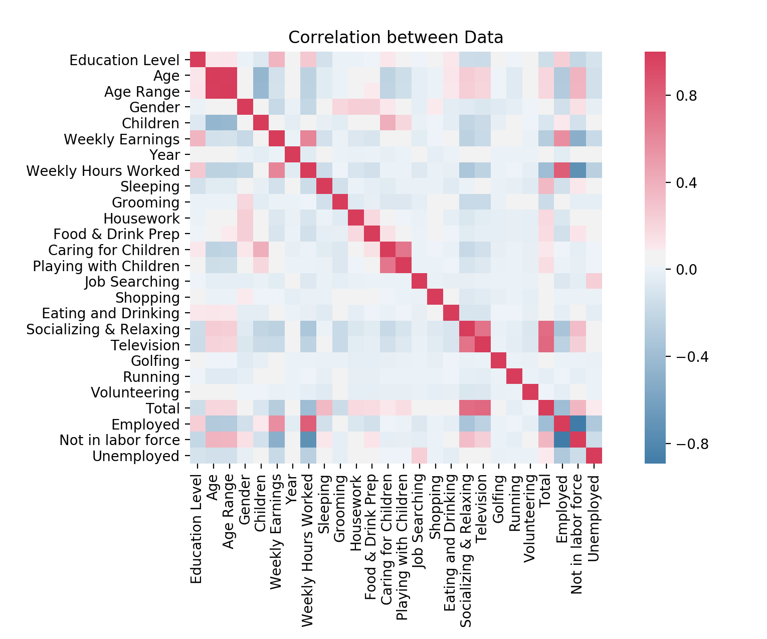
I won’t break down the whole thing, but here are some pertinent conclusions we can draw from the data:
-
there are the expected correlations, like weekly hours worked/weekly earnings being highly correlated with each other, and with employment
-
there are also the expected negative correlations, like socializing and relaxing having an inverse relationship with weekly hours worked
-
there are also ones I would consider useless, as they barely correlate with anything - for example, “Golfing” and “Shopping”. These can likely be tossed out of the dataset in order to decrease the noise.
I also wanted to create some additional heatmaps that would help us to visualize the data. Since the correlation heatmap only describes a general sort of correlation, it is useful to see it up close, especially for correlations that are on the weaker side (closer to 0).
Here are a few heatmaps I made using seaborn, which is a library that can create some beautiful visualizations:
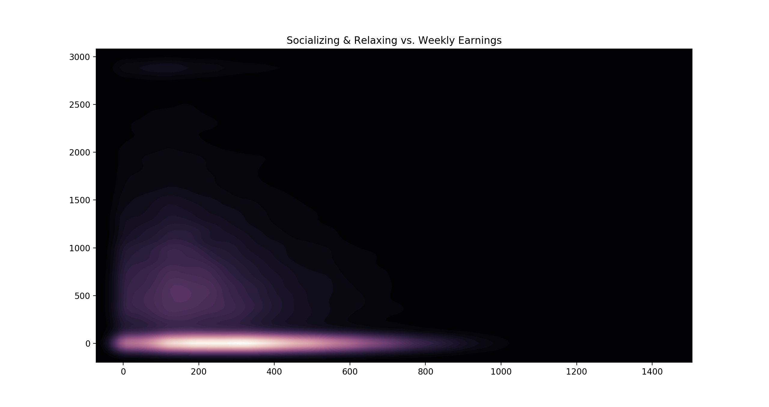
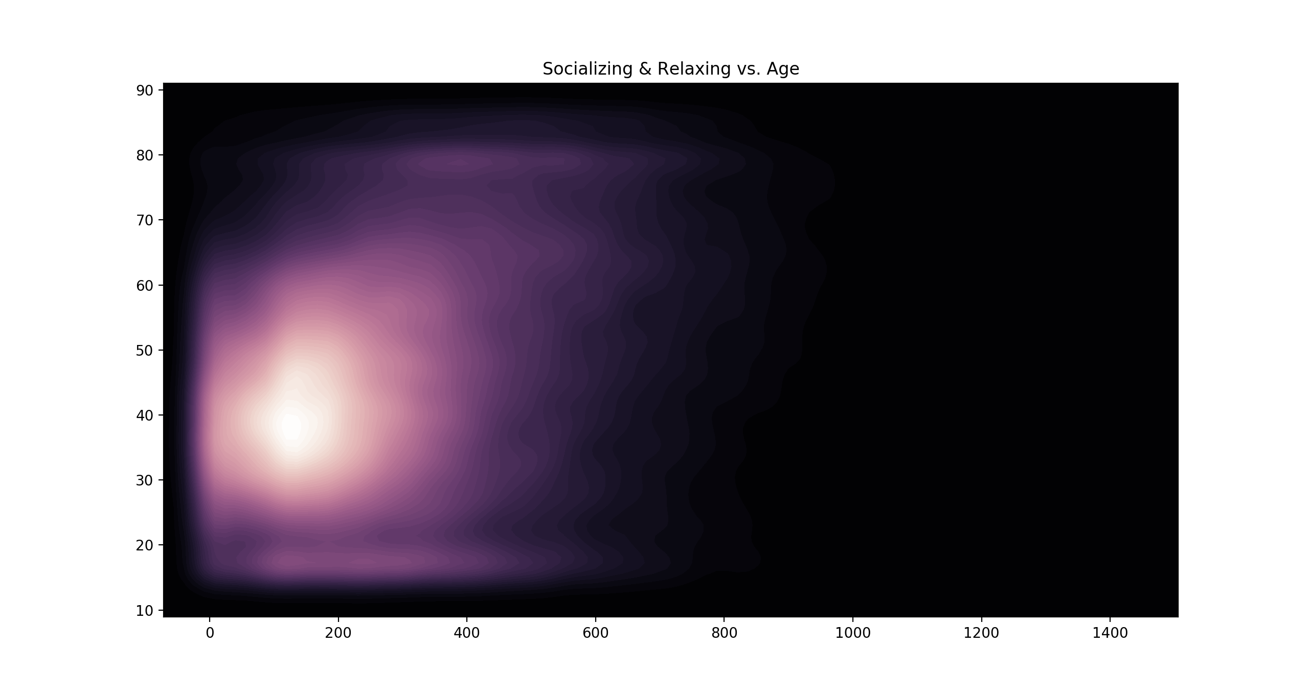
Here we can see how socializing and relaxing correlates with both age and earnings - the more time spent relaxing, the less the person tends to earn per week, and the older they tend to be.
The Algorithm
Now that we have a better understanding of the data, and have techniques to visualize it, designing an algorithm for prediction will be easier and more intuitive.
Here’s a multi-layer neural network I designed for predicting employment status:
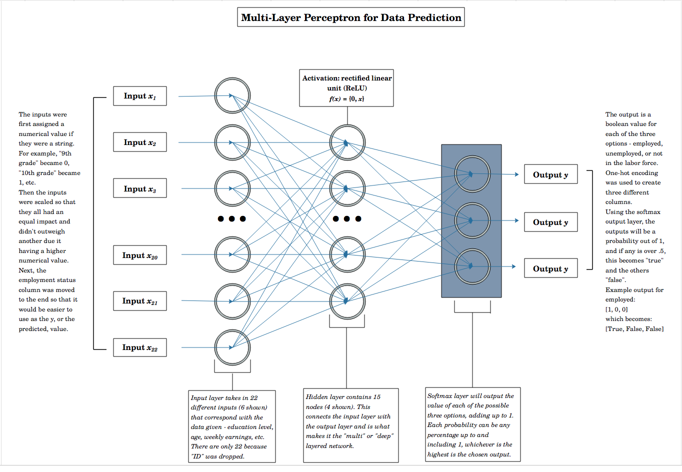
The basic design is a feed-forward network with the columns being the inputs (with a few being dropped, due to them being noise like “ID”, “Golfing”, “Shopping”). Then, it moves onto a hidden layer and finally on to the output layer, which uses a softmax function for the output.
The softmax function works by assigning a probability out of 1 to each of the three possible output values.
For example, it could look something like this:
$[0.1, 0.3, 0.6]$
Where $0.1$ is the probability of the person being employed, $0.3$ is the probability of them being unemployed, and $0.6$ is the probability that they aren’t in the labor force. This is useful, as it shows that no prediction can really be certain, and allows us to see what the algorithm is thinking.
However, we don’t want an array of probabilities, so we’ll add a line of code that will output the only probability out of the three that is above $0.5$. This way, it’ll give us it’s most likely prediction.
Here’s our neural network laid out in short:
##initialize the neural net
classifier = Sequential()

classifier.add(Dense(input_dim=22, units=22,
                    kernel_initializer= 'uniform'))

# hidden layer
classifier.add(Dense(activation= 'relu', units=15,
                     kernel_initializer='uniform'))

#Output layer
classifier.add(Dense(activation= 'softmax', units=3,
                     kernel_initializer= 'uniform'))

#Compile NN
classifier.compile(optimizer = 'adam', loss = 'categorical_crossentropy',
                   metrics = ['accuracy'])

#Fitting
history = classifier.fit(X_train, y_train, batch_size = 500, epochs = 50)

#Predict
y_pred = classifier.predict(X_test)
y_pred = (y_pred > .5)
In the last line, we change y_pred to values greater than $0.5$.
Predicting
Once I trained the model, I checked the accuracy using a graph:
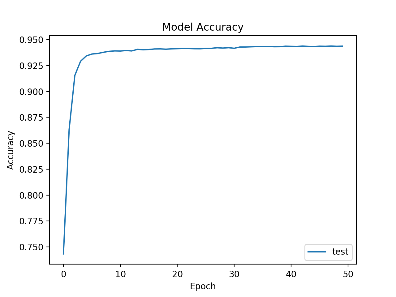
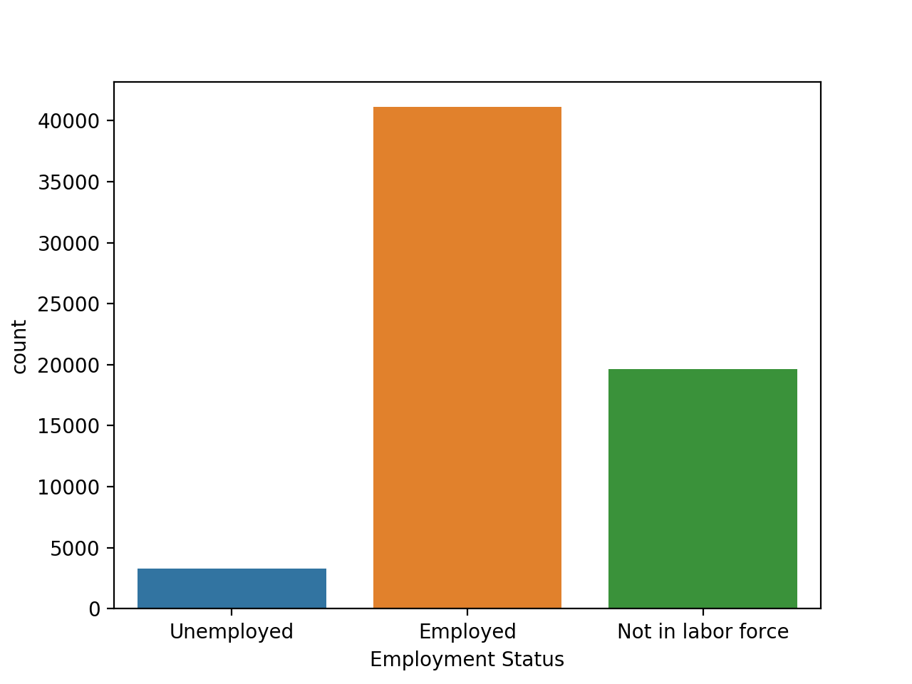
By the 50th epoch, the accuracy reaches nearly 95%. This does have me concerned about potential overfitting, so I decided to check the distributions of each of the three employment statuses, in both the training and test data. If they are similarly distributed, this shows the model is on the right track in terms of learning the trend.
Here is the training data’s distribution:
and here is the predicted data’s distribution:
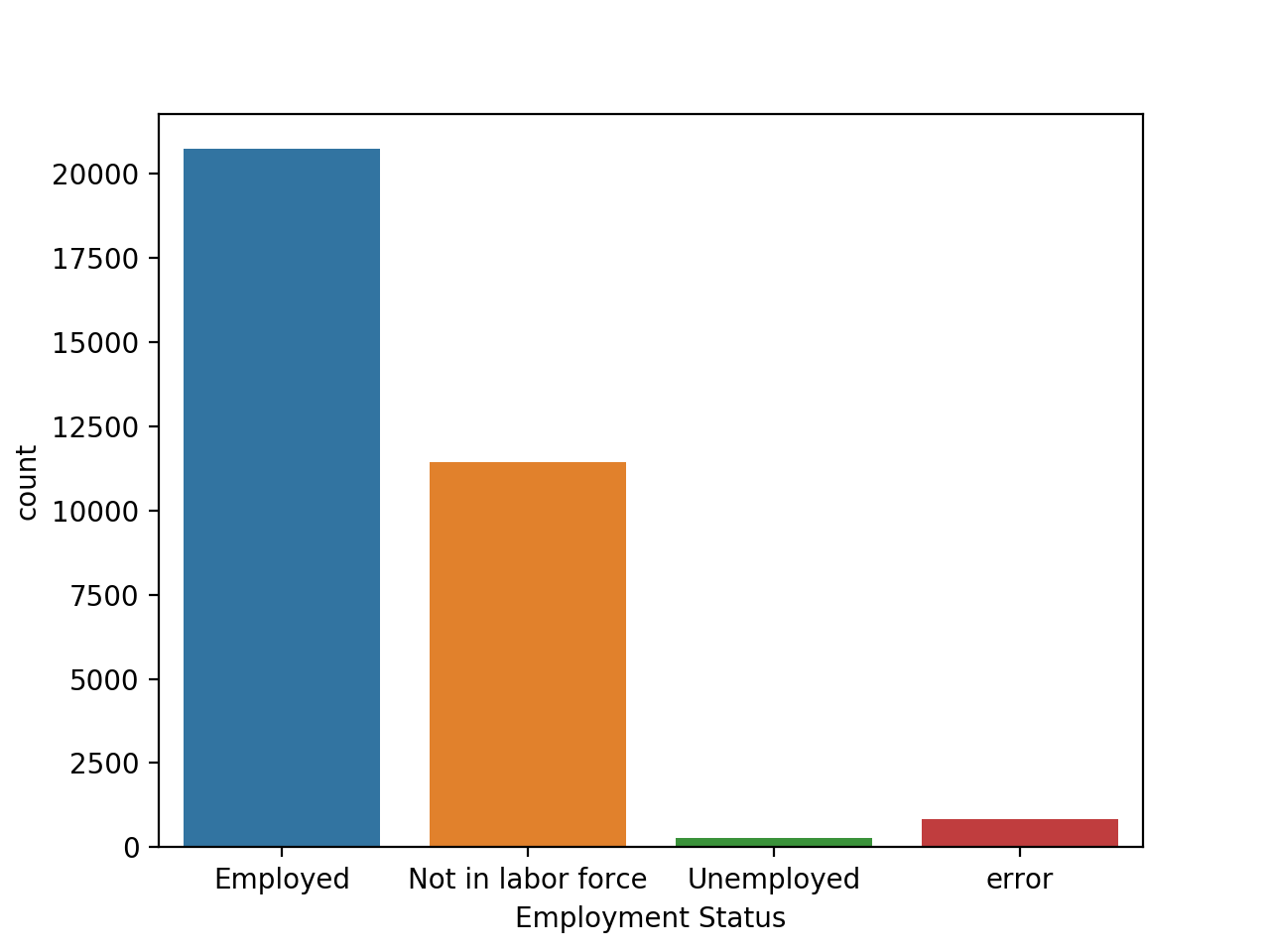
They seem to be similar in the overall pattern, with employment being the vast majority, followed by not in the labor force, and unemployment being a small percentage.
Overall, there are several improvements and tweaks that can be made, but this was my experimentation with the dataset. Any feedback is appreciated. Let me know what you think!
